Ova In Colour — Matthew McCormick Studio
A study in tonal evolution, grounded in form.
Overview
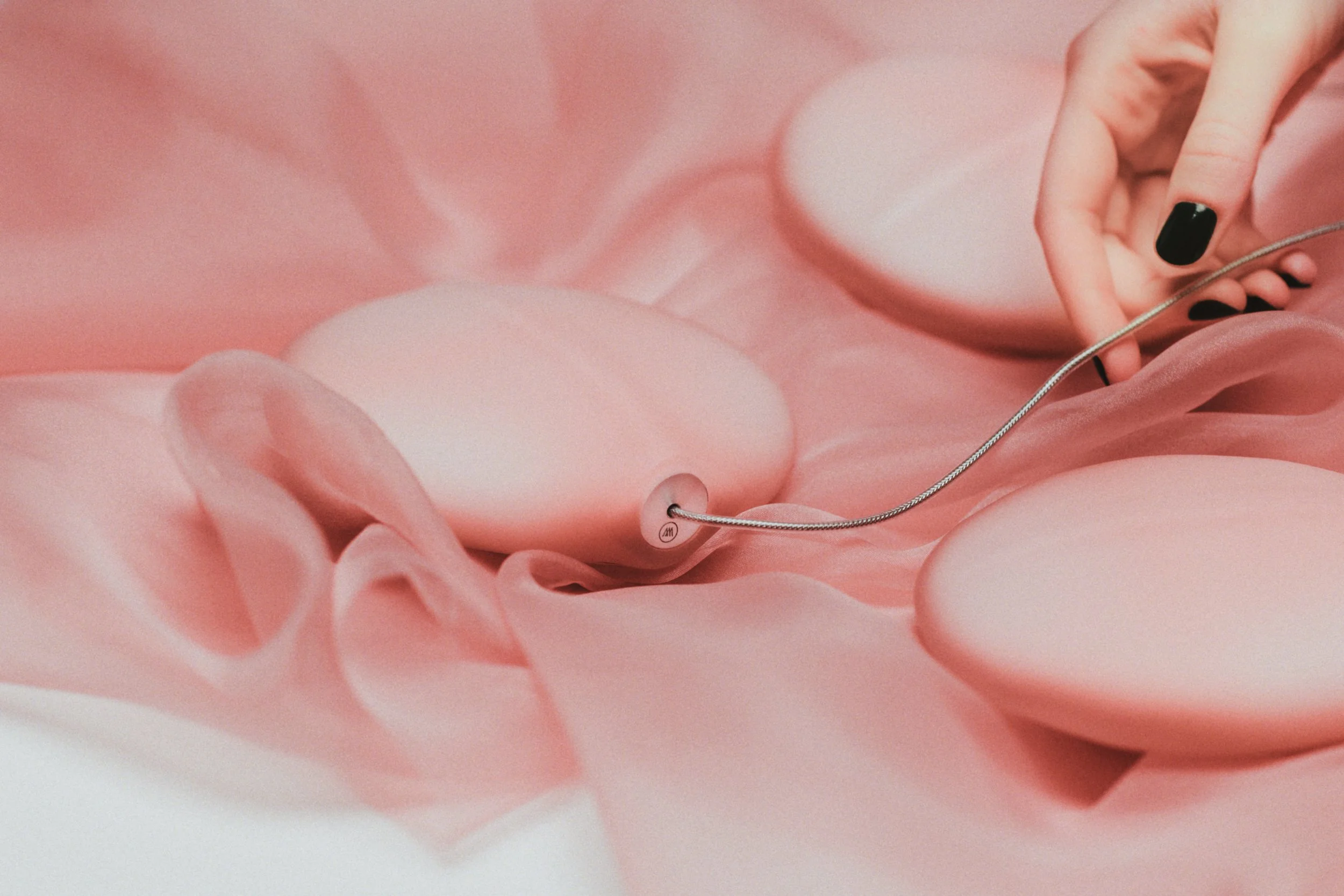
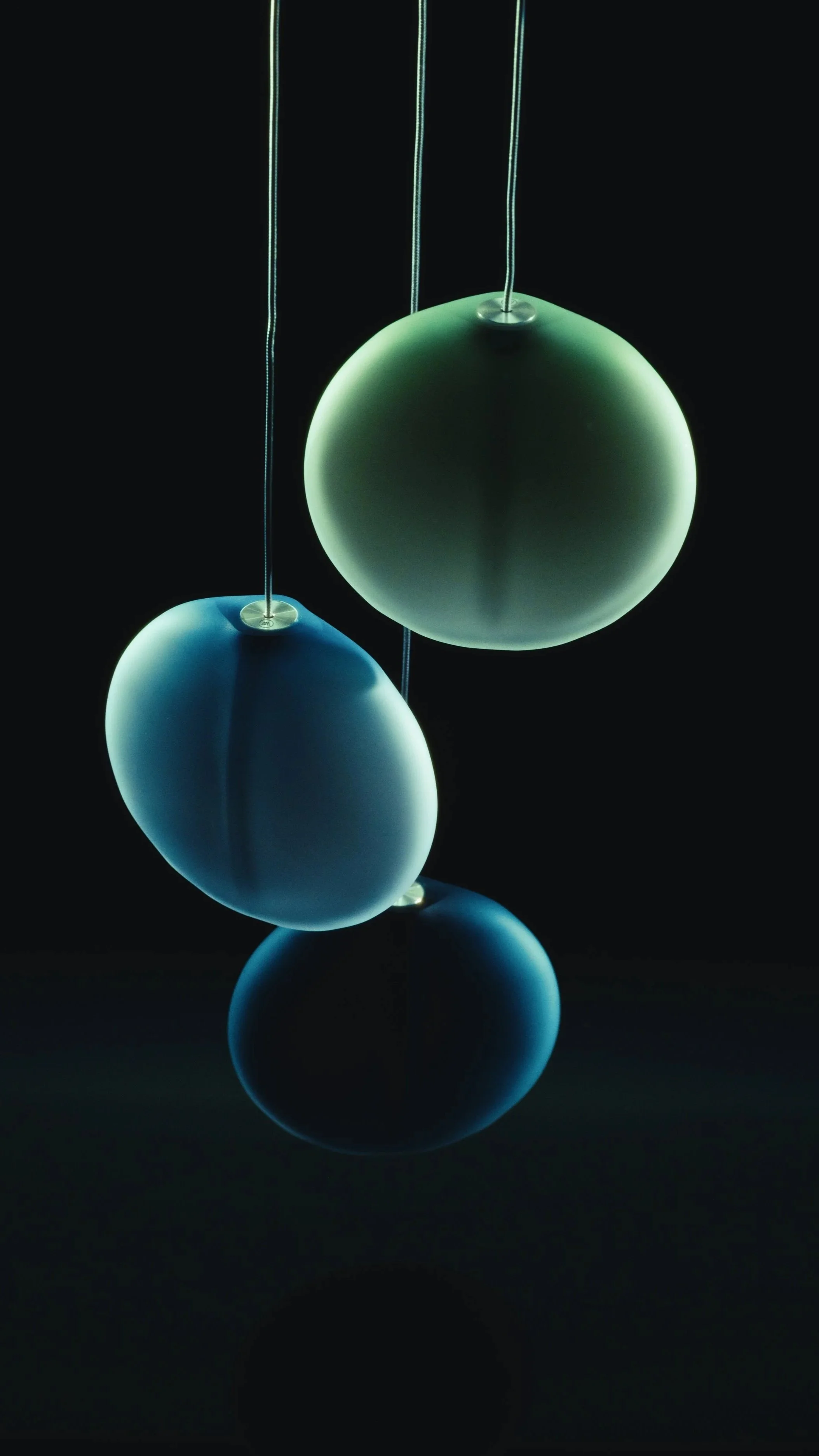
With the expansion of the OVA collection, our role was to reflect tonal growth without visual disruption. The campaign showed colour as continuity. Each new hue was intended to feel inevitable.
What We Made
+ Film and photography for launch and editorial use
+ Colour-specific product imagery
Approach
Each pigment was lit with subtle variation, allowing differences to emerge without shifting the structure. Clean compositions and consistent movement helped maintain clarity across the suite. The palette revealed itself through restraint.
Outcomes
+ Positioned the expanded collection as a natural continuation
+ Supplied launch visuals for digital and print platforms
+ Reinforced the studio’s measured approach to colour and form
Contributors
Client: Matthew McCormick Studio
Format: Film / Photography
Theme: Material / Design


